
While trying to improvise something, it’s always a fair deal snooping the doing of experts in the respective industry. And, when digital marketing is considered, one must first check out the landing page of websites that rule the roost.
Eye-catchy, responsive, and action-oriented landing pages always contribute to sales development and are crucial for the visitors traveling through the various stages of journey till they transform into a loyal buyer.
Since landing pages are an integral part of any marketing strategy, you will find below some perfect landing pages examples that will turn your eyes pinkish. So, let's dive in and get started.
Marketo
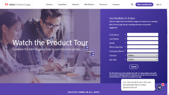
Marketo has the most-attractive and unique landing page that has everything a visitor could demand. Here are those features:-
- The landing page contains an appealing headline that illustrates visitors about the company.
- The page is a perfect blend of images and texts that provide visitors the ease of downloading reports whenever required.
- Now, come is bullet points, which let the prospectus easily scan the landing page as well as reports.
- Last, but not least, social proof. For an ideal landing page, it’s a must to have a place for customer testimonials and achievements in the media world. Marketo understands this concept and combines ravishing social proof to its landing page.
- Exit option- The logo of marketo and a valid link over the footer help people to get out of the website without the need of download.
- Form Fields: The less form fields will be there, the more visitors will feel interested in filling it out. Marketo doesn’t ask for information like ‘Company name’ or ‘Job role’ and that’s the reason why it collects bulks of quality leads everyday.
- Color of CTA button: The color aligns well with the overall design and pattern of landing page. There are multiple call-to-actions inserted on the page to deliver a stress-free and seamless experience to whosoever trying to convert into lead.
Slack

Slack acquires another most demanding landing page of the current time. The A& organized graphical view of a workplace often collects immense applause from the visitors. Come on! Have a look at its specifies:-
- Due to its special scroll down feature, Slack’s landing pages bring the convenience of reading entire information within a page, without the need of jumping over the next page.
- The lead pick-up form appears instantly without any issue that might feel bothersome to the people. All they need is to scroll down and identify the form.
- Visitors are in love with the CTA buttons given on this landing page since it’s small, focuses, and contains the word ‘free’.
- One of the best parts of this renowned landing page is the setup of a single lead capture form. It makes the process quick, easy, and hassle-free.
- Here, the images are colorful, bright, and adequate to the descriptions.
- Addition of social proof to give solid evidence to the visitors for signing up.
What deserve to be A/B tested:
- This landing page has got various exit links, mainly Slack logo, sign-in option, customer stories, and so on that assist visitors in leaving the site without turning into business leads.
- Visitors don’t need to comply with the company’s privacy policies while they provide email addresses to Slack.
Oracle

Oracle stands out because of its professional-looking landing page. There are approx two paragraphs and a translucent image that make it enticing for everyone. Let’s have a quick peek of further features it has:-
- Visitors at first see the Demand Gen Report that claims to be “recent,” but the same was established before 2016, and then copyrighted in 2017.
- People get the ease to view a playback of what they are going to see after downloading the blank paper provided on the landing page.
- The fabulous selection of color for the form immediately grabs the visitors’ attention and encourages them to proceed further.
Elements that deserve split testing:
- As exit links, the logo as well as navigation option form a shortcut that allows visitors to come out in no time without any formalities.
- Another exit link in the footer is a means to give more walk out options to visitors.
Can your landing page beat them?
This article has the 3 best landing pages example with a proper explanation of what is vital to gain better engagement. When you put everything in place, you will no longer run back in this race. Therefore, start working on your landing pages as soon as possible.